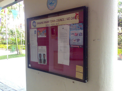
The HDB section may possibly have 2 sets of different colours scheme since they are split into 2 groups.

I’m sure glad that the town council is making some effort to ask the resident about the choice of colours they would like for our estate.
The following are the given choices:
PRE-WAR SECTION
 Proposal B
So I’ve got to walk around the estate to piece those pictures together.


4 comments:
I'm in the pre-war section and I like Proposal A, looks fresh and bright. Least favourite is Proposal C.
For Pre-War, personal preference is B for it emphasizes the correct part of the building.
For Post War, I thought D was the choice.
But most importantly, I feel the entire estate should be color coordinated as one (hopefully correct one). And that includes the market. :P
OMG...all the colour schemes are hideous...can we protest? :P
I am not in SIN so I cannot see the options clearly A and B looks the same? Its the least offensive. We can't have multi coloured blocks thsi is not Disneyland!! OMG ... it would be a disaster. The base colour should be the same if they really need a different colour for detailing it should be different shades of the same!!
Post a Comment